4 steps to colour your website!
Colour and your website
Think about colour! Everywhere in life you’re bombarded with colour. Colour shouldn’t just be restricted to what you can see but used to really bring your website to life. The way you use colour is important. So pick picking a great colour scheme is something to put some effort into. This post explains how to pick an effective colour scheme.
Colour schemes
A colour scheme is a series of complementary colours that you will use in your site. So rather than have everyone design their own page with the colours that they like, you pick a set of colours for everyone who updates the site to use. This includes finding photos that have those colours in them!
When thinking about a colour scheme for your site a good place to start is with your logo. It’s likely that your logo will appear on every page so the colour scheme will need to at least match that of the logo.
Picking your colours
A website should be filled with colours that are sympathetic with each other. This might sound complicated but don’t worry you don’t need to be a trained designer to work out what colours to use. Instead you can use one of the many colour wheel sites on the web. For example:
http://colorschemedesigner.com/csd-3.5/
There are lots of other sites but I’d recommend this one.
The site works on the basis of a colour wheel which and allows you to put in one colour and get a colour palette (group of colours) back that are all in sympathy with each other. This is achieved by taking colours that are close to each other in the colour wheel – to the left and the right of your main colour or that are directly opposite the colour in the colour wheel. For example our logo looks like this:
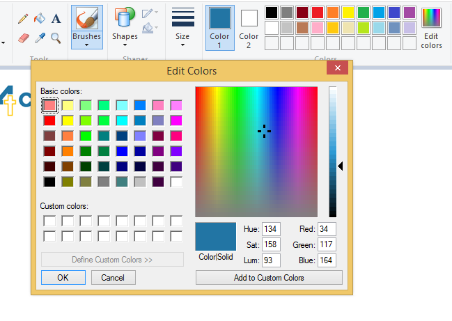
You can see that the core colour is blue. It is not just any blue but actually it is a solid blue. The html colour is #2175a4. You can find this colour by using a drawing program and using the colour picker tool. For example if you are using windows open up Paint. Next open up your logo/image. Now click on the dropper tool and hover over the colour you want to use and click on it:

Colour 1 (see arrow) changes to match that colour. Next click on the edit colours and you’ll find the Red, Green and Blue colours ( in this case 34,117, 164) which you can convert using a website like https://www.easycalculation.com/colorconverter/rgb-coder.php to an Html colour.

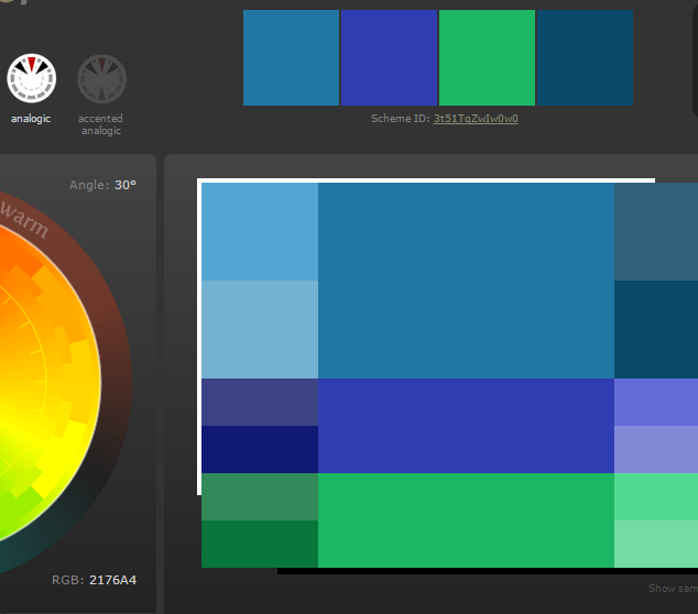
Now you have your core colour return to the colour wheel site and put that html colour in as the main colour. You’ll now be given a set of colours that match and you have your basic colour scheme. I generated the scheme shown using our website logo colour and the analogic option.

If this was your site then this would be the colour palette for it. Our site does use some of these colours but we use other colours too. If you’d like to know why then please give us a call.
Four easy steps to a colour scheme
Although this might seem complicated at first it is actually only for steps. These are:
- Get your core colour from your logo.
- Next put it into a colour wheel site.
- Pick an option that generates a set of colours you like.
- Grab and publish the colour palette.
It’s really easy and pretty straightforward to build a site colour scheme.
Once you have the scheme add it to the site style guide and make sure you give it to anyone who is producing content for the site. If you do this you’ll find that you build a Website that remains consistent in look and is pleasant for your visitors to look at.
