Church websites & Christian sites for everyone
When you thinking of church websites or Christian sites it’s important to be inclusive. By that I mean everyone should be able to find something they like on your website. In this follow up to the A Christian Website for everyone! post I want to talk about the type of thing that should be added to church websites or Christian site in order to make them interesting to the visitors.
I explain in the find out about section of this website about a few areas in more detail, I think though that they are so important that I want to mention them again here:
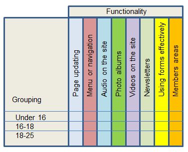
- Page updating
- Menu or navigation
- Audio on the site
- Photo albums
- Videos on the site
- Newsletters
- Using forms effectively
- Members areas.
Each of these areas has the potential to reach out to the visitors of church websites or Christian sites. It’s true to say that different people prefer different things and so it’s true for Christian sites. You need to think in terms of making the site fit with different potential visitors. I’ve talked before in this blog about the need to fully understand who your visitors are and now is the time to use that information effectively.
If you’re thinking about church sites in the way I think about them then you’ll probably have split the site readership into a bunch of groups. You won’t be thinking in terms of people that like Christian sites rather you’ll be thinking in terms of age rage and person type. For example:
Under 16’s
Who are unlikely to stay on the site for much time unless the content is very vibrant. So for this age range Christian sites that are very wordy are not going to work. You’ll need to be thinking in terms of interesting video or perhaps worksheets they can printout – word searches or colouring in or puzzles and so on.
16 -18
This group are really interested in becoming adults and figuring out “how they fit in” so material along that line. Nothing too serious or long. Perhaps some controversial stuff about how to change the world.
18-25
In this group people are generally just moving in to jobs or University or College. So they are looking for material on church sites that will support them. Stuff about how they can keep their Christian faith in an ever increasingly secular society. Information about what to do when such and such happens. For example what to say to a non Christian friend who is drinking too much or taking drugs or …
I could go on in terms of age range and in more detail about each group but really I wanted to illustrate that this is about understanding the potential visitors and thinking about whether the site has anything that would work for them.
If you understand Chruch websites or Christian sites visitors then grouping them together can allow you to consider what functionality will work for them and how it can be used effectively. You can easily draw up a table and fill in the material to allow you to keep track of what strategy you’re going to use for each group and how you’ll implement.
Don’t forget that you’ll be unlikely to try to implement all things at once instead you’ll need to have a plan to introduce things gradually and see whether they are working or not. Church websites and Christian sites are a long term development not a short term race. So taking an example perhaps you’ve decided that you want to focus on the youth of the church. Well church sites need to contain videos and interesting download material. Spending time adding lots of articles and text isn’t going to be very helpful.
For all church websites and Christian site you need to plan out the campaign that you’re going to undertake. Perhaps you might settle on a video campaign. Something that is popular on You Tube and so has the potential to be popular on church websites. You can translate a chart of Christian sites functionality against age group (or whatever groupings you’ve built) into a campaign chart pretty easily. Simply draw up something like this:
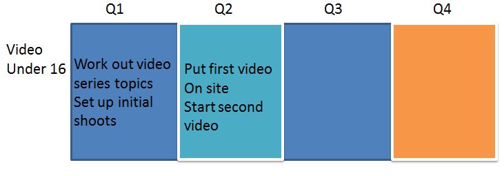
Aside from the garish colours you can see the point of the chart. I’ve only included a few simple things here to give you an idea of what to put. It would of course be straightforward to extend this to give more detail and more substance. One note of caution though for church websites or Christian sites I’d encourage you to have an overview rather than a detailed analysis. Generally speaking small, clear steps are easier to handle than larger and more complex ones. In short the less the steps the more likely you are to make them
2 Responses to 164-church-websites-for-everyone
Leave a Reply
Archives